Book a demo
A focused demo, mapped to your network and your processes — run by someone who has migrated networks like yours. Or start with the question that changes everything: how good is your data, really?
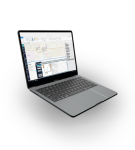


MNI is a reporting and BI layer that simplifies dashboards, reports and KPIs by presenting standardised, business-friendly names instead of the complex, versioned data model underneath.
For: strategy, leadership, planning, finance and regulatory teams. Outcome: real-time KPIs, faster and more accurate decisions, and no quarterly report scramble.

MNI ships with ready-made geographic datasets and dashboards, so the business sees the network the moment it's connected:


A geographic layer of every consumer type — residential homes, businesses, antennas and more — flagged as fully connected (spliced and patched) to the PoP. Powers a dashboard of connected versus total consumers, with a breakdown per region.

A geographic layer showing used and available splices and connectors within racks and splice closures.

A geographic layer of occupied versus available microducts along the route — a microduct is “occupied” once a cable is installed in it.
A geographic layer of occupied versus available fibres in each cable — a fibre is “occupied” when it’s part of an end-to-end connection between a consumer and a PoP — plus a layer aggregating utilisation per cable type and route (distribution versus backbone).

Under the hood: AI/ML and computer vision read unstructured legacy — spreadsheets, PDFs, Visio, diagrams — alongside geospatial tooling, always with a human in the loop. Start with a Data Assessment, or see how we use AI.
Ask for a Data AssessmentHow we use AI?
A focused demo, mapped to your network and your processes — run by someone who has migrated networks like yours. Or start with the question that changes everything: how good is your data, really?